Portfolio CMS
- Jun 2023– Jan 2024
- Role
- Sole Designer
- Duration
- 6 months
- Tools
- Kirby CMS
- PHP
- JavaScript Vue
- HTML & CSS
- YAML
- Figma
- Features
- CMS Theme Development
- PHP
Brief
- Create a Kirby CMS Theme for my portfolio website as if for a client who wants full control over content
- Create default page templates that account for client needs and maintain a cohesive, unified look
- Include a working Contact Form, About page, and specially designed Home page
Applying New Skills

First portfolio design
I originally started this project in 2021, when I took the Web Design II class at Diablo Valley College. We were provided with a Kirby license to create our own portfolio website. This project gave me the fundamental style for my current site.
When I took this class I had never done any programming before, JavaScript or otherwise. This class only taught a few PHP loops and variables specific to Kirby and YAML for the back-end panel. Separate from any class requirements, I created a basic JavaScript header animation, which is still featured on my website now. (The latter alone took me two weeks' time.) All in all, my end product was very limited, but it did still form the fundamental structure of my Site Architecture and Client Panel design.
However, after I finished all my coursework in 2023, I came back to my Portfolio project in earnest. Besides a layout redesign, all I have done is fulfill my original plans for the site that were simply too ambitious to complete without programming knowledge. By this time I had at least taken an introductory JavaScript class, so I was a little more familiar with programming, but I was still learning so much. This took much more time and dedication, since I was creating my own website while learning two new programming languages.
Intro To the Real Project
Learning how to use a Content Management System involved a lot of detail work and planning. Creating my own "theme" from scratch meant that I decided almost everything.
Doing it all myself is both a blessing and a curse: I could take as much time as I needed, but there also is no end to the amount of things I could keep on perfecting. While there certainly was a lot I needed to take the time to learn to make everything function, this project really became about learning prioritization and organization.
The other inherent challenge in theme development was learning how to make a customizable back-end for non-coders. Designing an entire interface that non-coders can understand and use without my help required significantly more of and a very different use of PHP than I had known up until that point. I essentially taught myself how to do it all and I'm so proud of how it turned out.
Designing the Back-End
Coding the entire back-end was its own challenge; matching panel input to the front-end output, creating entire panel layout designs that were at once easy to use and highly variable. I challenged myself to make my theme as customizable as I could, so even another web designer wouldn't feel too limited. I balanced this with lots of customizable layout options, specially coding some CSS shortcuts that accommodate common needs, and also providing lots of places to add your own HTML IDs and Classes for coders.
Since I cannot provide a live version of the Panel I created, I provide links to the Kirby CMS Reference page and try to give a basic explanation of the different Kirby components I'm referencing. If you have no experience with Kirby, I highly recommend trying Kirby's Panel demo, specifically the Restaurant and Microsite examples which are set up in Layout Blocks, to understand Blocks and Layout Blocks some before you read about my portfolio Panel.
Contact Forms
I've certainly designed and coded HTML & CSS for HTML Forms before, as seen in my Noah Franklin project Contact Page and the Dog Park Finder where I used JavaScript to create my own search bar. However, I had never before programmed a form to actually send to my email. I had to research HTML Form safety, best UX practice, and code it all.
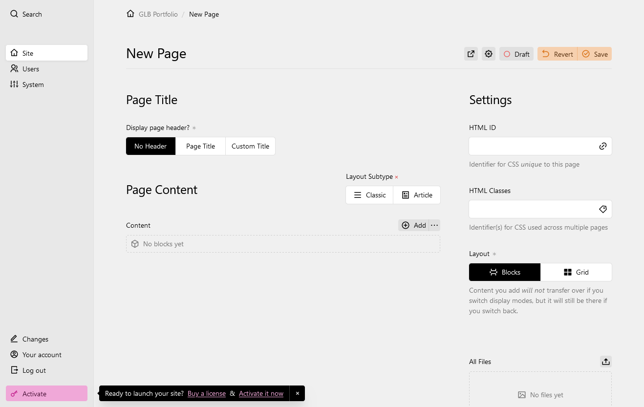
Default Page Template
Instead of creating various page presets, like "blog posts" and "image gallery," I coded a Default Page that is itself almost entirely customizable. It is all based upon usage of Kirby Blocks, which are spaces for specific types of content. These Blocks can be stacked together as the client chooses, to display their content however they believe works best.
Still, there are many different ways to arrange Blocks that the client must decide first, before adding content into Blocks. The Settings bar's Layout option offers two choices: Blocks or Grid.
Layout
In the more basic "Blocks" option, content is all organized in one column. Within this single column, I provide two different "Layout Subtypes." The "Classic" Layout Subtype displays Blocks one-by-one down the page. "Article" style, however, can float non-text Blocks around the text body. Each media-type Block is displayed just below the Block above it, but with the addition of a floatLeft or floatRight class, also beside the following Text and/or Heading Blocks, unlike "Classic." However, the Layout option must be set to "Grid" to add any columns.
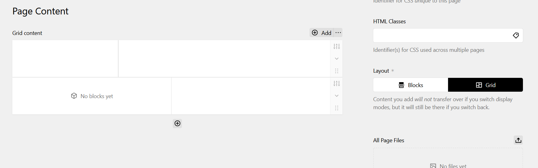
The "Grid" Layout uses Kirby's Layout Block to act like a container for the Blocks inside of it. Layout Blocks divide content space into one or more columns, inside of which Blocks are placed.
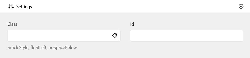
In Kirby Layout Blocks settings, users can add different self-explanatory CSS classes to the HTML like noSpaceBelow, moreSpaceBelow to change vertical spacing. For content flow, articleStyle makes Blocks within that specific Layout Block flow like the aforementioned "Article" style.
For more advanced customization, every page has a space in the Panel for custom HTML IDs and Classes. These attributes are applied to the main tag, so clients can add any page-specific and/or page type-specific CSS as long as the corresponding main#pageHTMLID or main.pageClassName selector is correctly placed in the code.
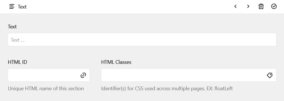
Blocks
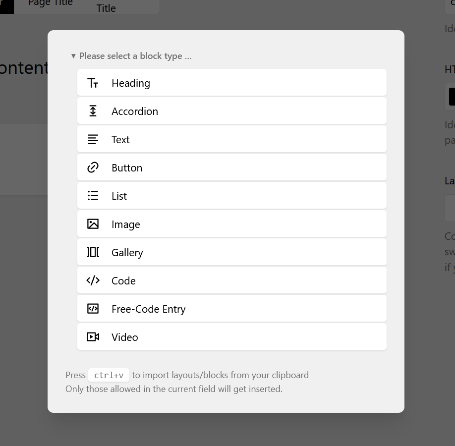
The "New Block" dialogue for Panel Content
Blocks are the spaces where actual content is uploaded to or added. For some types of content, like videos or text, the Block name is self-explanatory. Blocks are organized by the content type and how it is displayed. For example, the Image Block displays a single image in an HTML figure, whereas the Gallery Block is intended to display a collection of figures together.
While a few Block types didn't require many changes from the original Kirby Blocks, some required extensive editing, and a few I made myself.
Gallery Block
The Gallery Block turned out to be the most complicated. Though I based it on the Kirby Gallery Block, in order to make it accessible and customizable I had to balance a lot of different considerations, both in coding and visual design.
The first and most immediate problem was I needed to have different Gallery Block sizes so I couldn't just make one Gallery image source set.
I used the Kirby thumbs Config Option to name different image source set arrays, just typing my best guess in for the image widths. I wanted to connect these Config Options to the Block first, since I had the least experience doing that. So I started by connecting all the components I needed together in the Gallery Block Snippet. I called the Blueprint size value ($size) for input into the thumbs option via $thumbs.
Each srcset array contains another array with the title representing the screen width in pixels and the value of 'width' being the max image width.
Final thumbnail sizes
<?php
return [
  'thumbs' => [
    'autoOrient' => true,
    'srcsets' => [
      'default' => [
        '299w' => ['width' => 290],
        '749w' => ['width' => 550],
        '999w' => ['width' => 725],
        '1199w' => ['width' => 900]
      ], // gallery block sizes
      'singlepicgal' => [
        '299w' => ['width' => 225],
        '749w' => ['width' => 540],
        '999w' => ['width' => 600],
        '1199w' => ['width' => 750]
      ],
      'minigal' => [
        '299w' => ['width' => 125],
        '749w' => ['width' => 250]
      ],
      'smallgal' => [
        '749w' => ['width' => 300],
        '999w' => ['width' => 350],
        '1199w' => ['width' => 300]
      ],
      'mediumgal' => [
        '299w' => ['width' => 150],
        '749w' => ['width' => 375],
        '999w' => ['width' => 400],
        '1199w' => ['width' => 360]
      ]
    ]
  ]
];
?>
Notice that the names of the srcset arrays above match the Blueprint's Image Size Field options (below).
name: field.blocks.gallery.name
icon: dashboard
preview: gallery
fields:
  size:
    label: Image Size
    type: toggles
    options:
      - value: 'minigal'
        text: mini
      - value: 'smallgal'
        text: small
      - value: 'mediumgal'
text: medium<?php
/** @var \Kirby\Cms\Block $block */
$size = $block->size()->or('smallgal');
$thumbs = $kirby->option('thumbs.srcsets.' . $size);However, I couldn't just call $srcset in my Snippet HTML, since it would just return the array. Kirby provides the $file->srcset() File Method to create an HTML srcset attribute, but I also needed the HTML sizes attribute for which there is no preexisting method.
Since I needed it in both the Gallery and Image blocks, I couldn't just make a normal function inside the Snippet without duplicating the code. I also couldn't make a Block Model, since those are specific to only one Block type. This led me to Kirby's Block Methods, which apply to all Block types. I just made sure to only call it in the Image and Gallery Blocks.
Block Methods Plugin for Gallery & Image Blocks
<?php
Kirby::plugin('geebee/block-methods', [
'blockMethods' => [
'sizes' => function ($chosenThumbs) {
$keys = array_keys($chosenThumbs);
$newKeys = [];
foreach($keys as $key) {
$newkey = rtrim($key, "w");
array_push($newKeys, $newkey);
};
$array = [];
$sizes = count($chosenThumbs);
for($i = 0; $i < $sizes; $i++) {
$thumb = $chosenThumbs[$keys[$i]];
array_push($array, "(max-width: " . $newKeys[$i] . "px) " . $thumb["width"] . "px, ");
}
$final = implode($array);
return substr($final, 0, strlen($final) - 2);
},
],
]);Essentially, the code takes the specified array from the Kirby Thumbs option and plugs the values into the right place for the image's sizes.
Now that I could visually see the Responsive Images in action, I tested each one in different viewport widths to optimize my responsive images.
Responsive Gallery Block PHP images code
<?php
/** @var \Kirby\Cms\Block $block */

$size   = $block->size()->or('smallgal');
$thumbs = $kirby->option('thumbs.srcsets.' . $size);
$imgCount = $imgs->count();
?>
<!-- gallery block -->
<section
class="gallery<?php if($imgCount == 1): ?> singlepic<?php endif ?>
<?php if($size->isNotEmpty()):?> <?= $size ?><?php endif ?>">
<!-- scrolling div -->
<div class="gallerywrap
<?php if($lightbox === true):?> photoswipe<?php endif ?>
<?php if($imgs->count() == 1): ?> singlepic<?php endif ?>">
<?php // loading each image
foreach ($imgs as $img):
$alt = $img->alt();
$src = $srcValue = $img->url();
$srcset = $img->srcset($size);
$caption = $img->caption()->kti();
if($imgCount == 1) {
$srcset = $img->srcset('singlepicgal');
$thumbs = $kirby->option('thumbs.srcsets.singlepicgal');
$sizes = $block->sizes($thumbs);
}
?>
<!-- image figure/"container" -->
<figure class="image">
<!-- image scroller div -->
<div>
<img
src="<?= $src ?>"
alt="<?= esc($alt) ?>"
srcset="<?= esc($srcset) ?>"
sizes="<?= $sizes ?>">
</div>
<?php endforeach ?>
</div>
</section>Free-Code Block
While the Code Block displays code itself in an HTML code tag with syntax highlighters, the Free-Code Entry block allows the client to display new objects that don't fit into any pre-existing Blocks. This was important for me to be able to display my App Interfaces on the Commuralist page, which Adobe designed as iframes.
I based my Free-Code Block's Panel design on the Code Block's, but added new fields for a caption and options to make it an HTML Figure.
<?php /** @var \Kirby\Cms\Block $block */
$code      = $block->code();
$figure    = $block->figure()->toBoolean();
$shortname = $block->shortname()->esc();
$caption   = $block->caption();
$slug      = $block->slug();
$classes   = $block->class();

// functions
$iterateClass = $block->doForEach($classes);

$eClasses = $classes->isNotEmpty() ? $iterateClass : "";
$shrtnm = $shortname->isNotEmpty() ? $shortname : "";

$hasSlug = $slug->isNotEmpty();
$getId = $hasSlug ? "id=\"". $slug->esc() . "\"" : "";
$isAnchor = $hasSlug ? "anchor " : "";
?>

<?php if($figure == true): ?><section <?= $getId ?> class="<?= $isAnchor ?>figure <?= $shrtnm ?> <?= $eClasses ?>">
    <figure class="freecode<?= $shrtnm ?>">
        <?= $code ?>
    </figure>
</section>
<?php if($caption->isNotEmpty()): ?>
<section class="freecode caption <?= $shrtnm ?>">
    <figcaption class="freecode <?= $shrtnm ?>">
        <?= $caption ?>
    </figcaption>
</section>
<?php endif ?>
<?php else: ?>
<div <?= $getId ?> class="<?= $isAnchor ?><?= $eClasses ?>">
    <?= $code ?>
</div>
<?php endif ?>panel.plugin("geebee/freecode-block", {
blocks: {
freecode: {
computed: {
figure() {
return this.content.figure || {};
},
codePlaceholder() {
return this.field("code", {}).placeholder;
},
languages() {
return this.field("language", { options: [] }).options;
},
shortname() {
return this.field("shortname", {});
},
caption() {
return this.field("caption", {});
},
capPlaceholder() {
return this.field("caption", {}).placeholder;
}
},
template: `
<div class="k-block-type-freecode-container">
<div class="k-block-type-code-editor">
<k-input
ref="code"
:buttons="false"
:placeholder="codePlaceholder"
:spellcheck="false"
:value="content.code"
type="textarea"
@input="update({ code: $event })"
/>
<div class="k-block-type-freecode-aside">
<div v-if="figure == true" class="k-block-type-code-editor-shortname">
<k-input
ref="shortname"
:buttons="false"
:spellcheck="false"
:value="content.shortname"
type="slug"
@input="update({ shortname: $event })"
/>
</div>
<div v-if="languages.length" class="k-block-type-code-editor-language">
<k-icon type="code" />
<k-input
ref="language"
:empty="false"
:options="languages"
:value="content.language"
type="select"
@input="update({ language: $event })"
/>
</div>
</div>
</div>
<div v-if="figure == true" class="k-block-type-freecode-caption">
<k-writer
ref="caption"
:placeholder="capPlaceholder"
:spellcheck="false"
:value="content.caption"
type="writer"
@input="update({ caption: $event })"
/>
</div>
</div>
`
}
}
});/* container */
.k-block-type-freecode-container {
margin: .5rem auto .25rem;
display: flex;
flex-direction: column;
gap: .75rem;
}
/* code editor */
.k-block-type-freecode .k-block-type-code-editor {
padding: 0.5rem .75rem 1rem;
}
/* code */
.k-block-type-freecode .k-block-type-code-editor>.k-input {
border: 2px solid var(--color-gray-800);
border-radius: var(--rounded);
}
/* .k-block-type-freecode .k-block-type-code-editor .k-textarea-input-native {
padding: 0.25rem .5rem;
} */
.k-block-type-freecode .k-block-type-code-editor .k-textarea-input-native:focus-visible {
background-color: var(--color-gray-800);
border-radius: var(--rounded);
}
/* aside */
.k-block-type-freecode-aside {
position: relative;
margin-top: 1rem;
display: flex;
justify-content: flex-end;
gap: 1rem;
}
/* language */
.k-block-type-freecode .k-block-type-code-editor-language,
.k-block-type-code-editor-shortname {
position: relative;
}
/* short name */
.k-block-type-code-editor-shortname {
font-size: var(--text-sm);
}
.k-block-type-code-editor-shortname input {
color: var(--color-gray-400);
width: 100%;
padding: .375rem .375rem .375rem .5rem;
}
.k-block-type-code-editor-shortname input:focus-visible {
background-color: var(--color-gray-700);
color: var(--color-white);
}
.k-block-type-code-editor-language .k-icon {
position: absolute;
top: 0;
padding: .5rem 0 0 .5rem;
height: 1.5rem;
width: 1.5rem;
color: rgb(216, 216, 216);
z-index: 3;
}
.k-block-type-code-editor-shortname .k-text-input {
z-index: 1;
font-size: var(--text-xs);
}
/* caption */
.k-block-type-freecode-caption .k-writer {
padding: .25rem .5rem .5rem;
border: 1px solid var(--color-gray-400);
border-radius: var(--rounded);
}Lightbox
The way I designed my desktop-size layout, the header position is fixed to display the animation wherever you are on the page. However, because the article content must cover part of the header image, to keep the header visible I have to split the screen. This means less space for showcasing project images, which are also vital for any portfolio site. The playful and creative design of this animation gives my website character, and so I felt it important to keep.
The only way to keep the animation and still have enough room for images was to make a lightbox, something I had never done before. Being relatively inexperienced, I try to make everything from scratch so that I can expand my capabilities, but I already had a lot to do just to make my Kirby theme. Finding a pre-made lightbox plugin made the most sense.
Full Gallery Block PHP with Lightbox
<?php
/** @var \Kirby\Cms\Block $block */

$blockcaption = $block->caption();
$size         = $block->size()->or('smallgal');
$lightbox     = $block->lightbox()->isTrue();

$thumbs       = $kirby->option('thumbs.srcsets.' . $size);
$sizes        = $block->sizes($thumbs);

$imgs         = $block->images()->toFiles();
$imgCount     = $imgs->count();

?>
<!-- gallery block -->
<section
    class="gallery<?php if($imgCount == 1): ?> singlepic<?php endif ?>
    <?php if($size->isNotEmpty()):?> <?= $size ?><?php endif ?>
    <?php if($blockcaption->isNotEmpty()): ?> captioned<?php endif ?>">

    <!-- scrolling div -->
    <div class="gallerywrap
    <?php if($lightbox === true):?> photoswipe<?php endif ?>
    <?php if($imgs->count() == 1): ?> singlepic<?php endif ?>">


    <?php // loading each image
    foreach ($imgs as $img):
        $alt      = $img->alt();
        $src      = $srcValue = $img->url();
        $srcset   = $img->srcset($size);
        $caption  = $img->caption()->kti();

        if($imgCount == 1) {
            $srcset = $img->srcset('singlepicgal');
            $thumbs = $kirby->option('thumbs.srcsets.singlepicgal');
            $sizes  = $block->sizes($thumbs);
        }
        ?>

        <!-- image figure/"container" -->
        <figure class="image
            <?php if($imgclass->isNotEmpty()):
                foreach($imgclass->split() as $class): ?> <?= " " . $class ?><?php endforeach; endif;
            if($caption->isNotEmpty()):?> captioned<?php endif ?>">
                <!-- image scroller div -->
                <div>
                    <!-- lightbox link -->
                    <?php if($lightbox === true): ?>
                    <a href="<?= $src ?>"
                        data-pswp-src="<?= $img->resize(1800)->url() ?>"
                        data-pswp-width="<?= $img->resize(1800)->width() ?>"
                        data-pswp-height="<?= $img->resize(1800)->height() ?>"
                        target="_blank">
                    <?php endif ?>
                    <!-- image html tag -->
                    <img
                        src="<?= $src ?>"
                        alt="<?= esc($alt) ?>"
                        srcset="<?= esc($srcset) ?>"
                        sizes="<?= $sizes ?>">
                <?php if($lightbox === true): ?>
                    </a>
                <?php endif ?>
            </div>

            <!-- image caption -->
            <?php if ($caption->isNotEmpty()): ?>
            <figcaption class="img">
                <?= $caption ?>
            </figcaption>
            <?php else: ?>
                <figcaption class="img" aria-hidden="true"></figcaption>
            <?php endif ?>
        </figure>
    <?php endforeach ?>
    </div>

    <!-- gallery caption -->
    <?php if($blockcaption->isNotEmpty()): ?>
        <figcaption class="gallery">
            <?= $blockcaption ?>
        </figcaption>
    <?php else: ?>
        <figcaption class="gallery" aria-hidden="true"></figcaption>
    <?php endif ?>

</section>
Even though I decided to use a preexisting plugin, it didn't turn out to be as simple as copy-and-pasting the code. I had to find and fix a compatibility issue that stopped the plugin from functioning at all. I went through my page content code dozens of times before I realized that I had written a global JavaScript variable that conflicted with the plugin.