Commuralist: Mobile App
- Sep– Dec 2022
- Role
- Sole Designer
- Duration
- 3 months
- Tools
- Adobe XD
- Features
- UX & UI Design
- Design Thinking
- Live Product
Brief
- Semester-long project for DVC's User Interface Design for Web and Mobile class.
- Design an app for the greater good of your community.
- Create a high-fidelity prototype of the app along with a Support Website and Pitch Deck.
Creating the Idea
I came up with this idea after seeing Visit Oakland's Murals section and learning more about the Community Rejuvenation Project murals inspired by the surrounding community and their history. I thought, why have one person create a mural for a whole community when you could bring the community together to create their own mural?
Planning the App Structure
Obviously, easier said than done. There were a lot of factors to consider: how do you make everyone, including people with no experience in art, feel they can provide meaningful contributions; how do you allow community members as much or as little participation as they want while still making all contributions feel meaningful; just to name a few. I had to design a process myself that guided users through designing a mural in addition to creating app architecture and interface that balanced teaching with creative freedom.
I first wrote down all of what was floating around in my head onto a piece of paper. From there, I could follow my trains of thought into distinct ideas.
App Functions
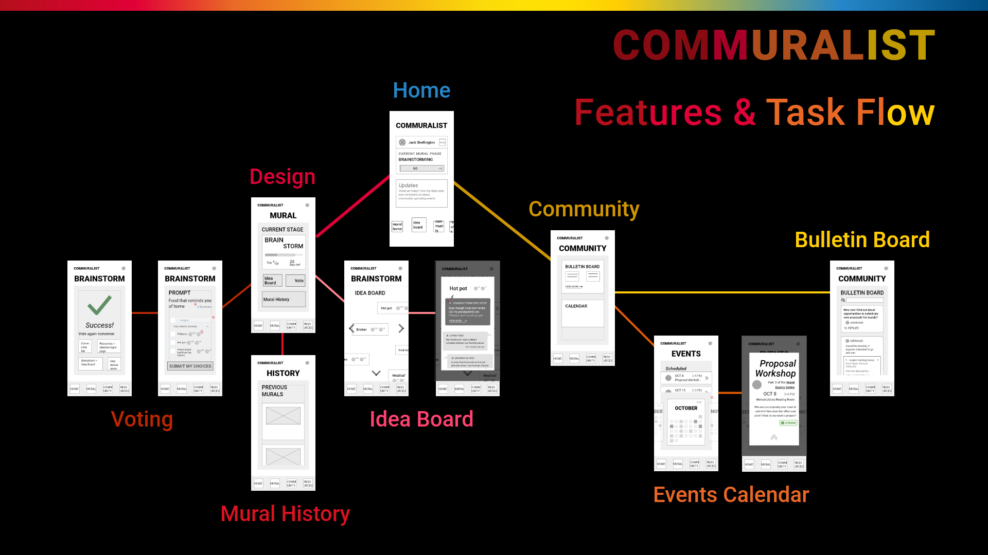
I organized the app into different sections for contributing, creating community, and learning how to contribute, respectively, each of which I explain below.
Excerpt from my Pitch Deck
I thought through what I would want as a contributor. Being excited and intrigued by a collaborative app, I would immediately want to get involved. For that reason, I decided to start with the Design section.
Design 
After community members scan a QR code painted directly onto the wall, they are taken to the website's Voting page. Visitors can only vote once unless they sign up, but anyone can add new ideas and/or vote on existing ones and already contribute to the project. Piggybacking off of that initial success, the visitor is then asked to make an account and download the app to vote again and see additional features.
On the app, new muralists are then introduced to the Idea Board, which displays all ideas submitted thus far with comments sections attached. There, people can discuss how they came up with their idea or how they might realize it in a design. After seeing the creativity in everyone's ideas and engaging in conversations, users become inspired to look for more opportunities to connect with people or come up with more ideas themselves, so I added the Community and Resources sections next.
Community
The Community section allows everyone to share more broadly any visual art and creativity interests with each other. The goal is to connect the community outside of direct contributions to the mural so that they begin to develop or deepen existing relationships.
On the Bulletin Board people share personal art projects, events, ask questions to the group, and support each other. To more literally bring people together, an Events page shows all upcoming mural trainings and painting shift sign-ups, as well as events happening in the area that users have shared.
Resources
The Resources section is designed specifically to be the extra support for people who want to contribute but feel like they need some more guidance. The material covered here gives muralists the tools to discover their own ideas and helps them make contributions to the mural they feel proud of.
Resources provide important foundational information on ideation, design, and public art specific to the current mural stage with short exercises at the end that reinforce what they learned. Muralists are encouraged to share their work on the Bulletin Board with the option to get feedback. Ultimately, as they find their inner artist's voice, they bring that creativity and openness back to the Design section and Community Bulletin Board.
Mural History
As an art piece made by and for the community, murals will change as the community's overall population changes and as individuals change with time. This is why I decided to make college students the primary audience: the student body changes every semester, and colleges are now bringing students back on campus for the first time since the pandemic began.
After spending years in a social bubble, having a long-term project whose primary goal is to bring people together will help students more easily connect to each other and, as a result, more effectively and successfully transition to college life.
Wireframes
Low-Fidelity (Lo-Fi) App Wireframes
See in full screen
The most important interface of my app is arguably the Idea Board, so I made that first. When I was designing the layout I knew it couldn't look like the typical online forum with everyone's ideas in a huge list. No matter how randomly the list was ordered, it would inherently imply priority. I didn't want any ideas to get lost at the bottom, and I didn't want anyone to think certain ideas were “better” than others. Drawing from the classic brainstorming technique, I spaced every idea out like post-it notes on a wall.
Clicking on the idea opens up a comment section where the idea originator can optionally add their own highlighted comment explaining why they submitted it, and everyone else can write their own interpretation or add any thoughts they have.
Problem-Solving for Complexities
Using user input and collaboration to create a real-life end product makes Commuralist unique. Unfortunately, being so unique makes using the app less intuitive. For that reason, I emphasized creating a direct, familiar physical interface and provided unintrusive explanations wherever I could.
From the start, I made all interfaces as intuitive as I could. I made a simple ballot for the Voting section, and made the Bulletin Board and Idea Board Overlays into standard chronological comment sections. But the key element to sufficiently support users came from developing the final, fully fleshed-out High-Fidelity “Wireframes,” my final App Interface. To eliminate confusion, I made all Onboarding permanent. Instead of forcing people to hold all the information in their head, I placed noticeable yet consistently styled icons in corners to give everyone the option to play the onboarding at any time.
The Support Website
The QR code posted on the mural wall takes new visitors to the support website's Voting page. This allows anyone who visits the mural wall to vote at least once, without creating an account or downloading an app. Second, it gives community members a chance to see what Commuralist is and learn how it works so they have incentive to download the app.
The Finished Project
In the end I created three final products: the App Prototype and Support Website, and also an Idea Pitch Deck. The Pitch Deck is set up for presenting to potential investors, so it's only supporting information. However, it contains key takeaways from my UX design process and UI deliverables, as well as links to both my Prototype and Support Website at the end.
